Creative Image Slider
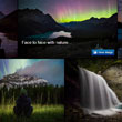
Creative Image Slider is a responsive jQuery image slider with amazing visual effects. It uses horizontal scrolling to make the slider more creative and attractive.
It is packed with a live-preview wizard to create fantastic sliders in a matter of seconds without coding.
Over
sites are already using Creative Image Slider!

Screenshots


Documentation
Installation
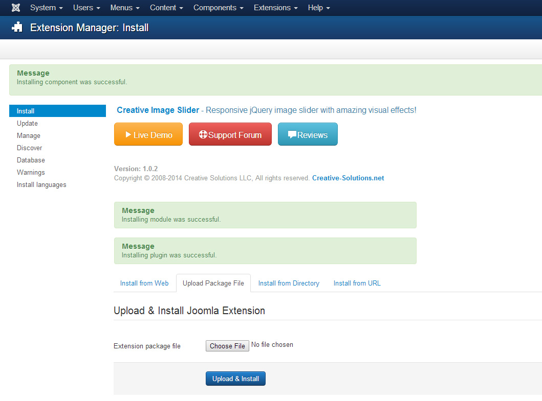
To install the extension download the last version, go to Extensions->Extension Manager->Upload Package File, Chosse the package and click Upload & Install. That will install the component, module and plugin. See Screenshot!
NOTE: The plugin will be enabled automatically!
NOTE: The plugin will be enabled automatically!
How to use
Creative Image Slider comes with component, module and plugin. Let's discuss them one by one.
Component
When using as component, it will be rendered in main content area.
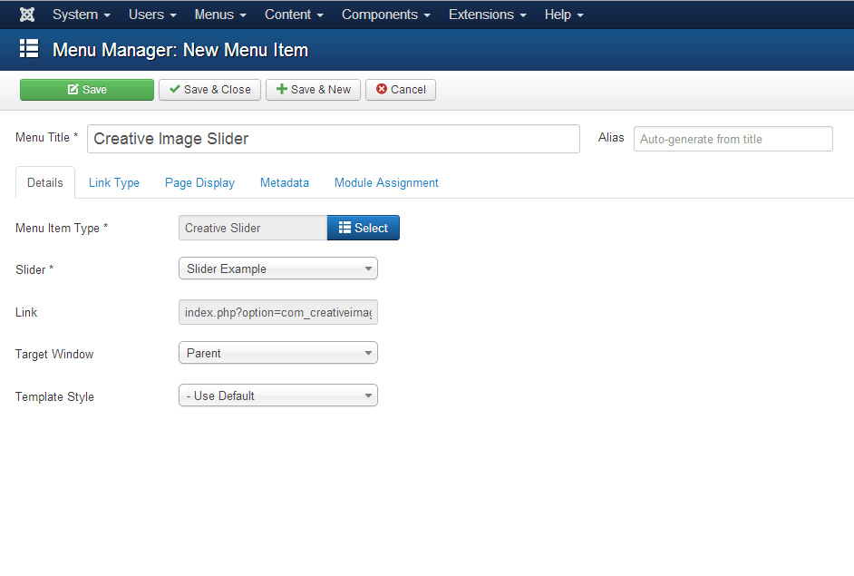
- Create a menu item, and set the type to Creative Image Slider. New field Slider will be opened. Select desired slider from list of sliders, and click Save. See Screenshot!
Module
When using as module, it will be rendered in any module position.
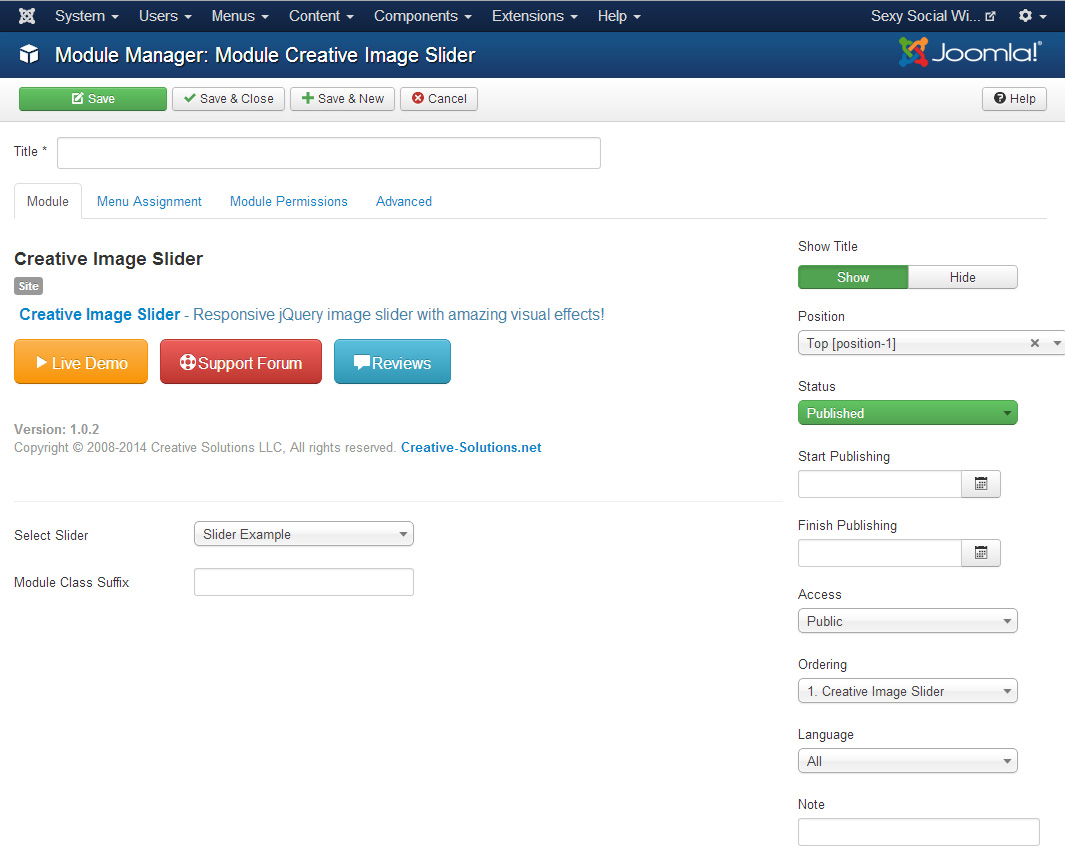
- Go to Extensions->Module manager->New, set the type to Creative Image Slider.
- Select the slider in Select Slider field.
- Set the position, by using the Position field.
- Activate the plugin by setting the Status to Published.
- If you need to add a specific class to module, use Module Class Suffix field.
- Set the Module Assignment to All Pages. See Screenshot!
Plugin
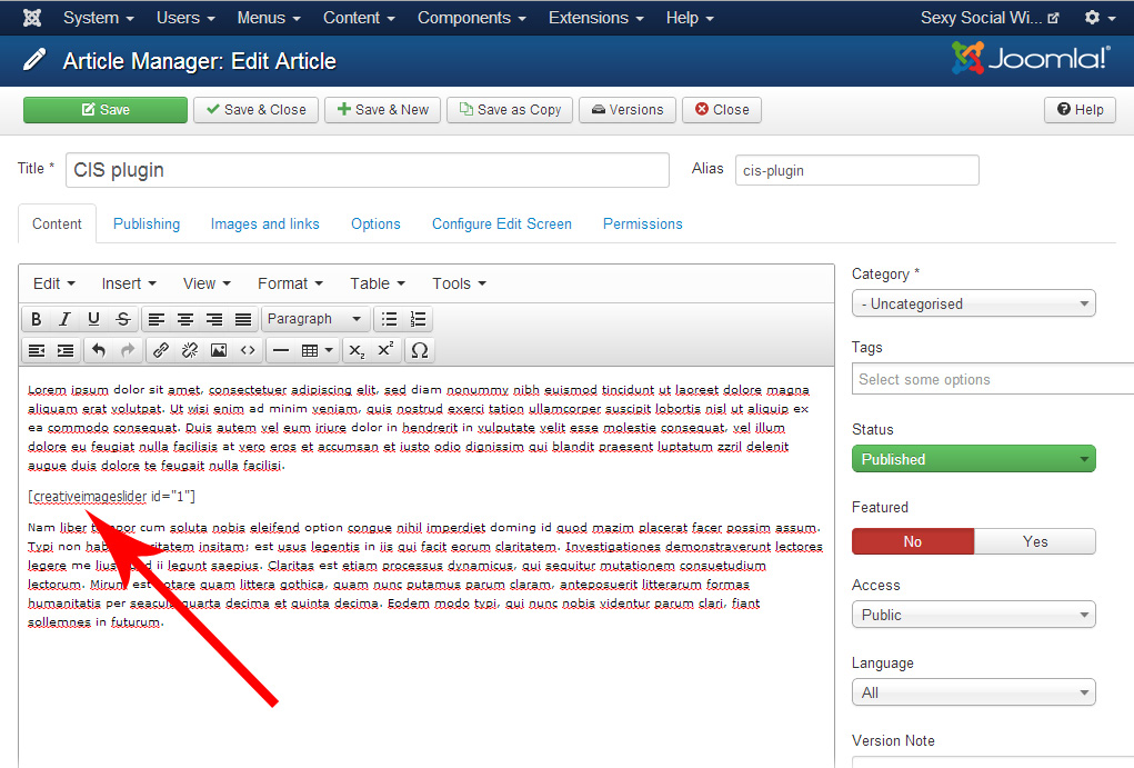
To insert Creative Image Slider anywhere in content, you need to use it as a plugin.
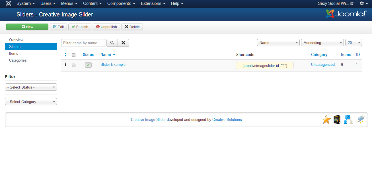
- To insert slider in content, use shortcode. It has the structure [creativeimageslider id="ID"]. Where ID is the id of desired slider. You can get the shortcode from sliders list page (Components->Creative Image Slider->Sliders). See Screenshot!
Just copy the shortcode and place anywhere in content. See Screenshot!
See the plugin demo
Requirements
Creative Image Slider will only work correctly if your setup meets these requirements.
- Joomla! 2.5.5 or higher.
- PHP 5.3+
- MySQL 5+
- meet the above requirements.
- do not have extension files or Joomla! core files which have been altered in any way.
Manage sliders
To manage sliders you need to go to Components->Creative Image Slider->Sliders. See Screenshot!
To edit existing slider, check appropiate checkbox from list of checkboxes, and click Edit button in top navigation panel, or just click on slider name.
To create new slider, click New button in top navigation panel.
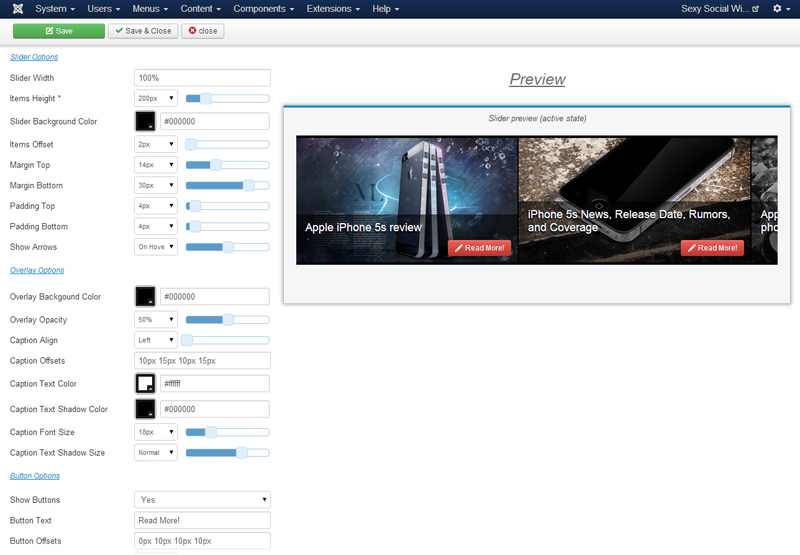
You will see the list of options. See Screenshot!
To edit existing slider, check appropiate checkbox from list of checkboxes, and click Edit button in top navigation panel, or just click on slider name.
To create new slider, click New button in top navigation panel.
You will see the list of options. See Screenshot!
Basic Options
- Name - The name of slider. It is used only on backend.
- Category - The category to which the slider belongs. By default is Uncategorized.
- Status - Slider publication status.
Sldier Options
- Slider Width - Set in px, or in percents. Example: 100% or 600px.
- Items Height - Slider Item Height(in pixels). The width for each item will be calculated automatically. Example: 300.
- Slider Background Color - The background color of slider.
- Items Offset - Items Offset(margin-right, in pixels). Example: 2.
- Margin Top - Slider top margin(in pixels). Example: 5.
- Margin Bottom - Slider bottom margin(in pixels). Example: 5.
- Padding Top - Slider top padding(in pixels). Example: 5.
- Padding BottomSlider bottom padding(in pixels). Example: 5.
- Show Arrows - The type to show arrows. Values: never, on hover, always.
Arrow Options
- Template - Arrow icon.
- Arrows Width - Arrows width. Height will be calculated automatically.
- Corner Offset - The offset from corner to arrow.
- Offset From Middle - By default, it places arrows in the middle of slider. Use this option to move arrows top or bottom.
- Opacity (Inactive State) - Arrows opacity when user not hovering it.
- Margin Bottom - Slider bottom margin(in pixels). Example: 5.
- Padding Top - Slider top padding(in pixels). Example: 5.
- Padding BottomSlider bottom padding(in pixels). Example: 5.
Overlay Options
- Overlay Backgound Color - Overlay Backgound Color.
- Overlay Opacity - Overlay opacity in percents.
- Caption Align - The alignment of item caption. Possible values: Left. Center, Right.
- Caption Offsets - Caption Offsets(Margin). Top, Right, Bottom, Left. EXAMPLE 5px 4px 5px 4px.
- Caption Text Color - Caption text color.
- Caption Text Shadow Color - Caption text shadow color.
- Caption Font Size - Caption font size.
- Caption Text Shadow Size - Caption text shadow size. Possible valuses: None, Low, Normal, High.
Button Options
- Show Buttons - Show Read More buttons? The global rule can be overwritten from item options.
- Button Text - Text of Read More buttons. The global rule can be overwritten from item options.
- Button Offsets - Button Offsets(Margin). Top, Right, Bottom, Left. EXAMPLE 5px 4px 5px 4px.
- Button Style - Read More Buttons Style. The global rule can be overwritten from item options.
- Button Align - The alignment of button. Possible values: Left. Center, Right. The global rule can be overwritten from item options.
- Button Size - Read More buttons size. The global rule can be overwritten from item options.
- Caption Font Size - Caption font size.
- Button Icon - Button icon. The global rule can be overwritten from item options.
Moving and Auto-Play
- Movement Step - The amount of pixels to be moved per one step. Default is 600.
- Movement Time - Time for one step(in miliseconds). Default is 600.
- Easing Size - Easing Size in pixels. This effect runs on end positions. Default is 60.
- AutoPlay Type - The type of auto-play. Possible valuse: No Auto-Play, Move Evenly, Move By Steps.
- AutoPlay Start Delay - AutoPlay Start Delay. Set in miliseconds. Default is 3000.
- Autoplay Hover Delay - The delay after which autoplay will restart after hover.
- AutoPlay Step Delay - Delay between autoplay steps. Set in miliseconds. Default is 5000.
- AutoPlay Speed - The speed of evenly animation.
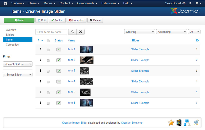
Manage items
To create/edit items you need to go to Components->Creative Image Slider->Items. See Screenshot!
Use the Filter: Slider and select the slider you need to configure. It will show the items, which belongs to selected slider.
To change items ordering, use the ordering field's drag and drop functionality. to change the items ordering(In Joomla 3.X). For Joomla 2.5.X - sort the rows by Ordering field, set apprepriate values for them, and lick Save icon.
To edit existing item, check appropiate checkbox from list of checkboxes, and click Edit button in top navigation panel, or just click on item name.
To create new item, click New button in top navigation panel.
You will see the list of options. See Screenshot!
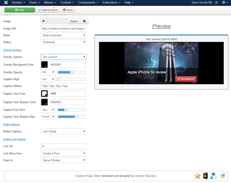
Main Options
- Name - The name of item. It is used only on backend.
- Caption - Item caption text.
- Image - Select image.
- Image URL - The url of image. Loads image from the WEB. Use when Image field is empty.
- Slider - The slider to which this item belongs.
- Status - Item publication status.
Overlay Options
- Overlay Options - Use global slider options, or set custom options for this item. Possible values: Use Global, Set Custom. If set to Set Custom, the following list of overlay options will be opened for this item.
- Overlay Backgound Color - Overlay Backgound Color.
- Overlay Opacity - Overlay opacity in percents.
- Caption Align - The alignment of item caption. Possible values: Left. Center, Right.
- Caption Offsets - Caption Offsets(Margin). Top, Right, Bottom, Left. EXAMPLE 5px 4px 5px 4px.
- Caption Text Color - Caption text color.
- Caption Text Shadow Color - Caption text shadow color.
- Caption Font Size - Caption font size.
- Caption Text Shadow Size - Caption text shadow size. Possible valuses: None, Low, Normal, High.
Button Options
- Button Options - Use global slider options, or set custom options for this item. Possible values: Use Global, Set Custom. If set to Set Custom, the following list of button options will be opened for this item.
- Show Buttons - Show Read More buttons?
- Button Text - Text of Read More buttons.
- Button Offsets - Button Offsets(Margin). Top, Right, Bottom, Left. EXAMPLE 5px 4px 5px 4px.
- Button Style - Read More Buttons Style.
- Button Align - The alignment of button. Possible values: Left. Center, Right.
- Button Size - Read More buttons size.
- Caption Font Size - Caption font size.
- Button Icon - Button icon.
Button Link Options
- Link Url - If the button enabled, this url will be used as link.
- Link Menu Item - Link Menu Item
Button link will be set to this menu item. To use this option left the Link Url field empty! - Open In - The page will be opened in new, or same browser window.
Other Creative Extensions
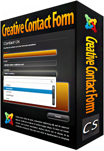
Creative Contact Form is a responsive jQuery contact form with amazing visual effects. You will be surprised by count of all the possible features!
It is packed with a Template Creator wizard to create fantastic contact forms in a matter of seconds without coding.
Over 134,200+ sites are already using Creative Contact Form!
Text To Speech for Joomla!
How it would be wonderful, if your visitors could listen any text from your site! We made that possible. We use Google power to provide you the best quality of automatic text to speech service. Enjoy!
Over 17,800+ sites are already using GSpeech!
Creative Gallery is a responsive gallery solution for Joomla with powerful functionality and amazing visual effects.
It is packed with a Template Creator Wizard with Live Preview, to create beautiful and creative galleries without coding!
Over 3,300+ sites are already using Creative Gallery!

Creative Social Widget presents social icons in very creative and original way! You will be surprised by count of all the possible features!
It is packed with a Live-Preview wizard to integrate social icons into any kind of design without css knowledge!
Over 6,800+ sites are already using Creative Social Widget!
