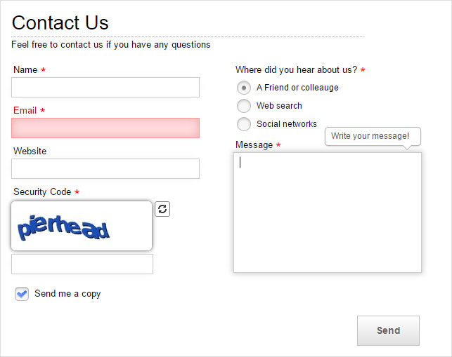
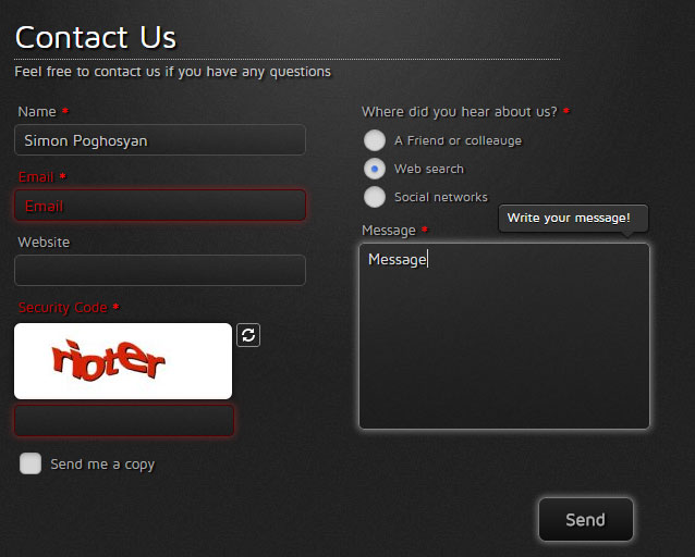
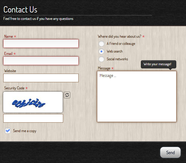
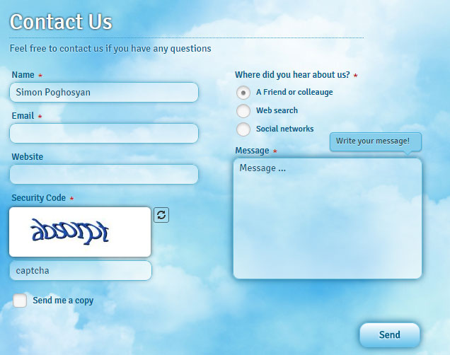
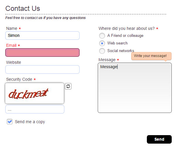
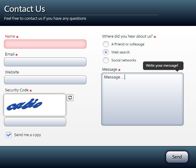
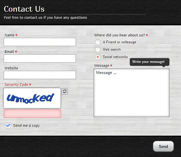
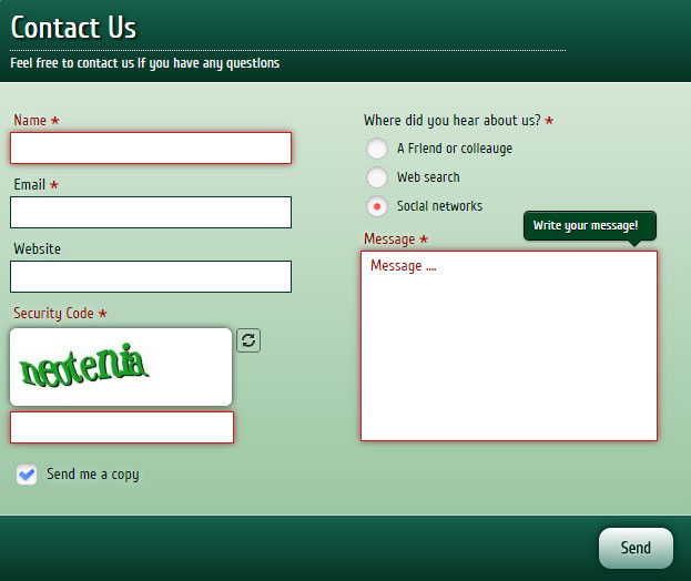
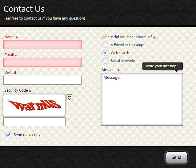
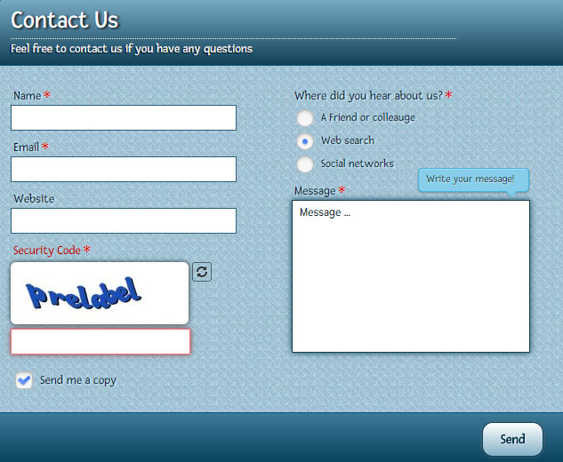
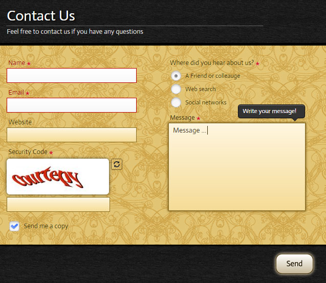
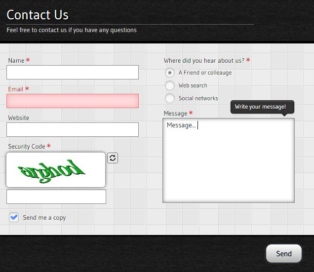
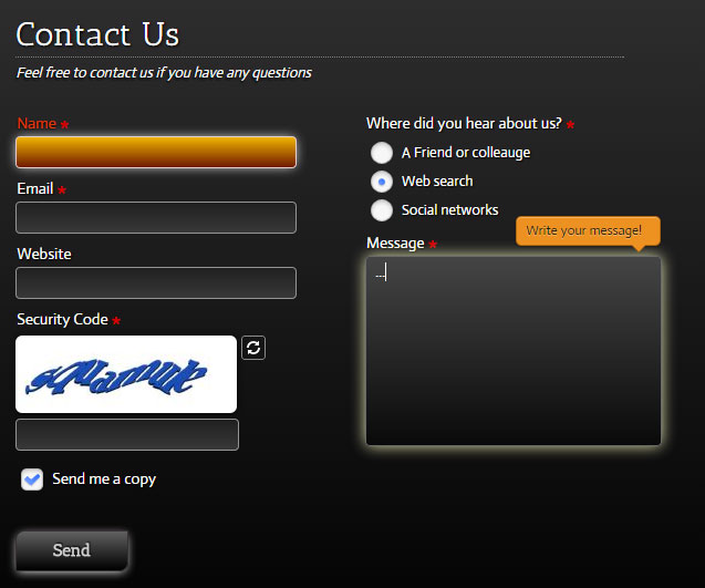
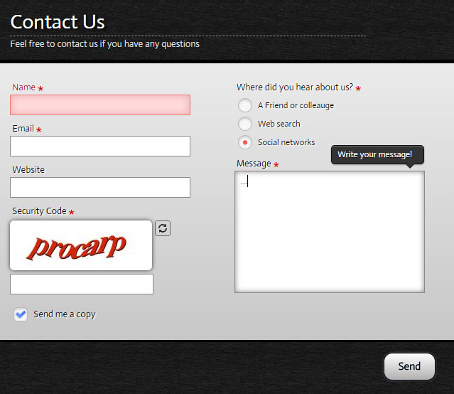
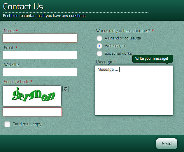
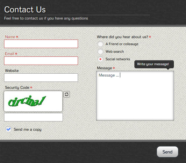
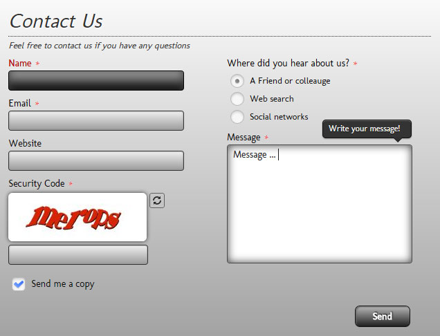
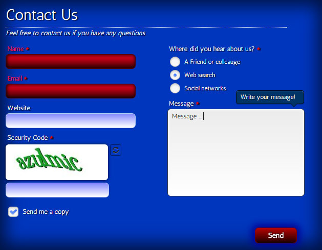
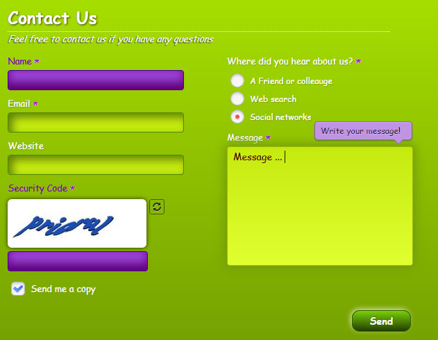
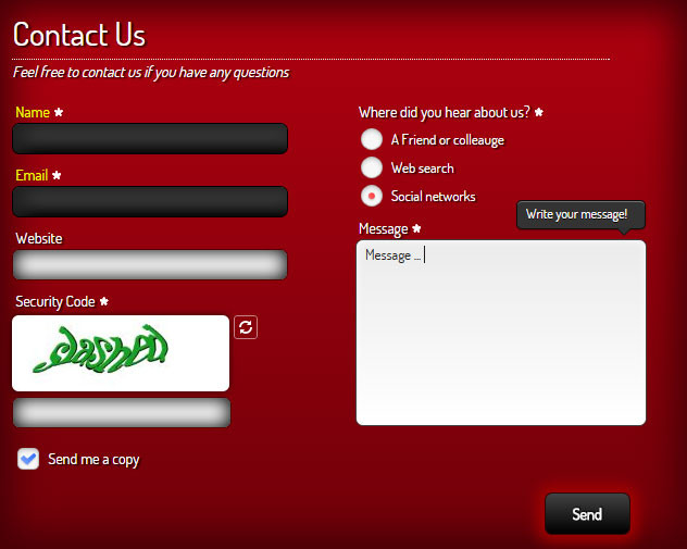
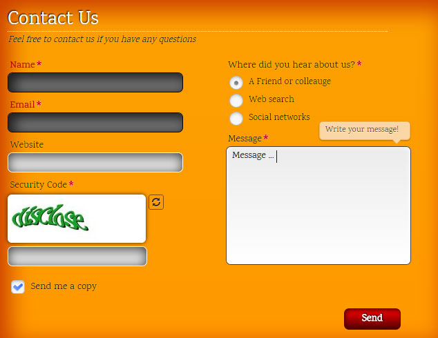
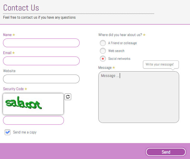
Creative Contact Form is a powerful contact form generator with amazing visual effects. You will be surprised by count of all the possible features!
It is packed with a Creative Template Creator Wizard to create fantastic forms in a matter of seconds without coding.
Over
sites are already using Creative Contact Form!

Version
6.0.0
Downloads
134,089
Compatibility
J3.X->J6.X
Rating


28,15,0,50,1
1,600,60,1,5000,1000,12,2000
0,2,1,1,2,40,10,5,4,1,1,15,0,1
Documentation
Installation
To install the extension download the last version, go to Extensions->Extension Manager->Upload Package File, Chosse the package and click Upload & Install. That will install the component, module and plugin.
NOTE: The plugin will be enabled automatically! See Screenshot!
How to use
Creative Contact form comes with component, module and plugin.
When using as component, it will be rendered in main content area.
- Create a menu item, and set the type to Creative Contact Form. New field Form will be opened.
- Select desired Contact Form from list of forms, and click Save.
When using as module, it will be rendered in any module position.
- Go to Extensions->Module manager->New, set the type to Creative Contact Form.
- Select the form in Select Creative Form field.
- Set the position, by using the Position field.
- Activate the plugin by setting the Status to Published.
- Set the Module Assignment to All Pages.
- Save the module.
To insert Creative Contact Form anywhere in content, you need to use it as a plugin.
- To insert form in content, use shortcode. It has the structure [creativecontactform id="ID"]. Where ID is the id of desired contact form. You can get the shortcode from Forms-List page (Components->Creative Contact Form->Forms). See Screenshot!
Just copy the shortcode and place anywhere in content. See Screenshot!
Requirements
Creative Contact form will only work correctly if your setup meets these requirements.
- Joomla! 2.5.5 or higher.
- PHP 5.3+
- MySQL 5+
- GD Library enabled (for captcha only).
- Free Type Library enabled (for captcha only).
Important: We can only provide support for setups that
- meet the above requirements.
- do not have extension files or Joomla! core files which have been altered in any way.
Managing Forms • Form Options
To manage forms you need to go to Components->Creative Contact Form->Forms. See Screenshot!
To edit existing form, check appropiate checkbox from list of checkboxes, and click Edit button in top navigation panel, or just click on form name.
To create new form, click New button in top navigation panel.
To copy form, open the form and click Save as Copy button in top navigation panel. It will copy all form fields and options as well!
Form options are separated to sections.
See Screenshot!
- Name - The name of form. It is used only on backend.
- Render Type - How to render the form. Possible values: Static, or popup types.
- Popup Button Position - Position of popup button. Values: Left or right.
- Top Text - Top Text of contact form.
- Pre Text - Pre Text of contact form. HTML is allowed!
- Popup Button Text - Text of popup button.
- Thank You Message - Message to show, after email successfully sent.
- Send Text - Send button text.
- Send New Text - Send New button text.
- Close Alert Text - Close ALert button text.
- Next Button Text - Text of Next Button.
- Prev Button Text - Text of Prev Button.
- Form Width - Set in percents, or in pixels. Example: 600px or 100%.
- Static Button Offset - Offset from top for static popup buttons.
- Template - Form template.
- Status - Form publication status.
Note 1: Usually the form works well when all email settings are empty. It will use global settings in that case!
Note 2: Some email servers require emails to be sent from the same server as the site in. If your domian is example.com,
then you should set Email To it to email1@example.com, and Email From to email2@example.com (different emails).
- Email To - Email of recipient. If blank then message will be sent to email set in global configuration. To add multiple recipitents, seperate them with coma(,).
- Email Bcc - Add bind carbon copy recipitens to the email. To add multiple recipitents, seperate them with coma(,).
- Email Subject - If blank, then (Message sent from SITE NAME) will be used.
- Email From - If blank, then it will be set to user inputed email, if it is empty, then to email set in global configuration
.
- Email From Name - Email from name.
- Reply to Email - If blank, then you will reply to user inputed email, if it is empty, then to email set in global configuration.
- Reply to Name - Reply to Name.
- Enable Redirect - Redirect to another page, after email has been sent.
- Redirect Menu Item - Redirect to this menu item, after email has been sent.
- Redirect Url - Redirect URL. If blank, menu item will be used.
- Redirect Delay - Time before redirect (in miliseconds).
- Show send me copy - Show 'Send copy to yourself' field.
- Send me a copy text - Send me a copy text.
- Shakes count - How many times shake field, if it is not valid.
- Shake Distanse - Shake distanse in pixels.
- Shake Duration - Shake Duration, set in miliseconds
- Show Page Title - If Yes, it will show in sent email the page title and page url of the user, who sent email!
- Show IP - If Yes, it will show in sent email the IP address of the user, who sent email!
- Show Browser - If Yes, it will show in sent email the Browser info of the user, who sent email!
- Show Operation System - If Yes, it will show in sent email the Operation System of the user, who sent email!
- Show Screen Resolution - If Yes, it will show in sent email the Screen Resolution of the user, who sent email!
Adds custom css to your form! It can be useful to change some default styles, without changing the css files!
To get current form id, use FORM_ID structure.
Useful examples!
- Hide Top Text - Use this script: .creative_form_FORM_ID .creativecontactform_title {display: none}
- Hide Header - Use this script: .creative_form_FORM_ID .creativecontactform_header {display: none}
- Hide Send Button - Use this script: .creative_form_FORM_ID .creativecontactform_send {display: none}
- Hide Footer - Use this script: .creative_form_FORM_ID .creativecontactform_footer {display: none}
Managing Fields • Field Options
To manage fields you need to go to Components->Creative Contact Form->Fields. See Screenshot!
To edit existing field, check appropiate checkbox from list of checkboxes, and click Edit button in top navigation panel, or just click on form name.
To create new field, click New button in top navigation panel.
To copy field, open the field and click Save as Copy button in top navigation panel. It will copy all form options as well!
To changes fields ordering, use drag-and-drop reordering in Joomla 3.x and orering values for Joomla 2.5.X.
Field Options are based on Field Type property. Let's discuss them one-by one.
Text Input, Text Area, Name, Email, Address, Phone, Number, Url
- Name - The name of field.
- Toltip Text - This text will appear in creative tooltip, when user focus the element!
- Form - The form this field belongs to.
- Field Type - The field type of this field.
- Columns Wrapping - Possible values: Both Columns, Left Column, Right Column.
- Required - Set the field as required or not.
- Status - Field publication status.
- Width - The width of field.
- Margin - Margin of element. Use the following structure: TOP RIGHT BOTTOM LEFT. If empty, the default 0px 0px 10px 0px will be used(margin-botom is 10px, all other are 0px). Can be used to easily move element. If you need to increase the space at the top, use this value: 20px 0px 10px 0px.
- Name - The name of field.
- Form - The form this field belongs to.
- Field Type - The field type of this field.
- Columns Wrapping - Possible values: Both Columns, Left Column, Right Column.
- Required - Set the field as required or not.
- Status - Field publication status.
- Width - The width of field.
- Margin - Margin of element.
- Options Ordering - Order field options by name, or by custom ordering value. To use custom ordering you can just drag and drop the options bellow, by using the drag icon near the option. See Screenshot!
- Show field name - Show the label for field element, or just show the options.
- Select tag default text - When none of options is selected.
- No results match text - Select tag search text, when no results to be shown.
- Show scroll after - Show creative scrolling after this count of options.
- Show search after - Show search after this count of options.
- Manage Options - You can add, delete, edit, show/hide, or re-order options. If there are no options yet, you will see also the Load Countries List icon near the Add New Option icon, which will load the list off countries(239 items). See Screenshot!
- Form - The form this field belongs to.
- Field Type - The field type of this field.
- Columns Wrapping - Possible values: Both Columns, Left Column, Right Column.
- Required - Set the field as required or not.
- Status - Field publication status.
- Width - The width of field.
- Margin - Margin of element.
- Options Ordering - Order field options by name, or by custom ordering value. To use custom ordering you can just drag and drop the options bellow, by using the drag icon near the option. See Screenshot!
- Show field name - Show the label for field element, or just show the options.
- Manage Options - You can add, delete, edit, show/hide, or re-order options. If there are no options yet, you will see also the Load Countries List icon near the Add New Option icon, which will load the list off countries(239 items). See Screenshot!
- Name - The name of field.
- Form - The form this field belongs to.
- Field Type - The field type of this field.
- Columns Wrapping - Possible values: Both Columns, Left Column, Right Column.
- Status - Field publication status.
- Width - The width of field.
- Margin - Margin of element.
- Wrong captcha message - The message to show, when the inputed captcha is not correct.
- Name - The name of field.
- Form - The form this field belongs to.
- Field Type - The field type of this field.
- Columns Wrapping - Possible values: Both Columns, Left Column, Right Column.
- Required - Set the field as required or not.
- Status - Field publication status.
- Width - The width of field.
- Margin - Margin of element.
- Show field name - Show the label for field element, or just show the options.
- Upload button text - The text of upload button.
- Upload min size (in bytes) - The min allowed upload size in bytes. 1KB = 1024 bytes, 1MB = 1024 KB.
- Upload max size (in MB) - The max allowed upload size in MegaBytes.
- Accepted file types - Seperated with vertical bar |.
- Min size error message - Min size error message.
- Max size error message - Max size error message.
- Invalid type error message - Invalid type error message.
- Name - The name of field.
- Form - The form this field belongs to.
- Field Type - The field type of this field.
- Columns Wrapping - Possible values: Both Columns, Left Column, Right Column.
- Required - Set the field as required or not.
- Status - Field publication status.
- Width - The width of field.
- Margin - Margin of element.
- Date Format - Default is mm/dd/yy.
- Animation - Type of animation to use for showing datepicker.
- Show Date Icon - If Yes, the date icon will be shown after the field.
- Input Readonly - If YES, datepicker will be opened onclick of input.
- Change Months - Allow to change months in datepicker.
- Change Years - Allow to change years in datepicker.
- Number of Months - Number of Months in datepicker.
- MIN Date - Set the min date as a numeric offset from today (-20), or as a string of periods and units ('+1M +10D'). For the last, use 'D' for days, 'W' for weeks, 'M' for months, or 'Y' for years.
- MAX Date - Set the end date as a numeric offset from today (-20), or as a string of periods and units ('+1M +10D'). For the last, use 'D' for days, 'W' for weeks, 'M' for months, or 'Y' for years.
- Name - The name of field.
- Form - The form this field belongs to.
- Field Type - The field type of this field.
- Columns Wrapping - Possible values: Both Columns, Left Column, Right Column.
- Required - Set the field as required or not.
- Status - Field publication status.
- Width - The width of field.
- Margin - Margin of element.
- Show field name - Show the label for field element, or just show the options.
- Custom Html - Input html here!
- Name - The name of field.
- Form - The form this field belongs to.
- Field Type - The field type of this field.
- Columns Wrapping - Possible values: Both Columns, Left Column, Right Column.
- Status - Field publication status.
- Width - The width of field.
- Margin - Margin of element.
- Heading Content - The content of heading. Html is allowed!
Note: To use heading in html, use this code:
{heading}heading content{/heading} structure.
- Name - The name of field.
- Form - The form this field belongs to.
- Field Type - The field type of this field.
- Columns Wrapping - Possible values: Both Columns, Left Column, Right Column.
- Required - Set the field as required or not.
- Status - Field publication status.
- Width - The width of field.
- Margin - Margin of element.
- Show field name - Show the label for field element, or just show the options.
- Google Maps Code - The iframe code you should get from google maps. You can get it from Basic Google Maps or by using New API. For more details read Maps Help Center guide.
- Name - The name of field.
- Form - The form this field belongs to.
- Field Type - The field type of this field.
- Columns Wrapping - Possible values: Both Columns, Left Column, Right Column.
- Status - Field publication status.
- Width - The width of field.
- Margin - Margin of element.
- Site Key - You can to get it from Googe ReCapcth API.
- Security Key - You can to get it from Googe ReCapcth API.
- Theme - Theme of ReCapctha. Possible Values: Light, Dark.
- Type - Type of ReCapctha. Possible Values: Image, Audio.
- Name - The name of field.
- Form - The form this field belongs to.
- Field Type - The field type of this field.
- Columns Wrapping - Possible values: Both Columns, Left Column, Right Column.
- Status - Field publication status.
- Width - The width of field.
- Margin - Margin of element.
- Contact Data: Contact Data contains from content sections. Each of them can have different icon.
Structure: {section icon="section_icon" label="section_label"}section_content{/section}
icon: The icon of section. Possible values: address, phone, mobile, fax, email, link, tip, info, question, map.
label: The label of section. Width of section label can be configured through Label Width option.
section_content: The content of section. HTML is allowed! To apply number styling, use {num}123{/num} structure.
Example: {section icon="phone" label="Phone:"}+00 (0) 123 456 789{/section}
- Label Width (px) - The width of section first column in pixels. Same for all sections in ceratin field.
- Name - The name of field.
- Form - The form this field belongs to.
- Field Type - The field type of this field.
- Required - Set the field as required or not.
- Status - Field publication status.
- Popup Content: HTML is allowed!
- Popup Embed - Can be used for rendering google maps, youtube, vimeo or any other embed code! Will be inserted after Popup Content.
Usage: To place a popup field, insert the following code where you need to add a popup link:
{creative_popup id="POPUP_ID" size="popup_size"}Popup Link Text{/creative_popup}
POPUP_ID: Id of the popup field. You can get it in field options.
See Screenshot!
popup_size: Size of popup window in pixels. EXAMLE:
800X600.
Note: Place popup fields at the end of form!
Usage: To create a creative scrollbar, create a
Custom Html field, and use the following structure:
<div class="creative_content_scrollbar">creative_scrollbar_html</div>
creative_scrollbar_html: You can have any html in creative scrollbar!
Scrollbar Templates: There are different scrollbat templates.
See Screenshot!
You can change scrollbar template from template options.
Managing Templates
To manage templates you need to go to Components->Creative Contact Form->Templates. See Screenshot!
To create new template, click New button in top navigation panel.
You will see the list of options.
See Screenshot!
- Name - The name of template.
- Start Values - The initial values of new template.
- Status - Field publication status.
To edit existing template, check appropiate checkbox from list of templates, and click Edit button in top navigation panel, or just click on template name.
You will see the Template Creator Wizard.
See Screenshot!
Use it to create your own template. The most parts of forms can be configured here. The names of options are intuitive, so you should not have issues configuring it.
Custom Code
To add a custom code (CSS, JavaScript) you need to go to Components->Creative Contact Form->Templates->Your Template.
Scroll to the bottom of the page: you will see custom code area! See Screenshot!
If you will have any kind of question, do not hesitate to write us at
Support Forum.


